Electricitymap.org is a beautiful interactive map site showing the production and consumption of each country's electricity supply, broken down by supply type and usage.
The Data 100, the Principles and Techniques of Data Science course at UC Berkeley is now available in an online book/website. The course follows on from the Data 8, the Foundations of Data Science, and the material for that course is also available online.
The New York Times have made public the data training material they provide to their journalists. Their three week internal course starts ar data handling from surveys and works up to creating data stories combining multiple data sources.
The Microsoft Academic Knowledge Graph is a RDF dataset of over 8 billion triples of information about academic publications across 200,000+ fields of study.
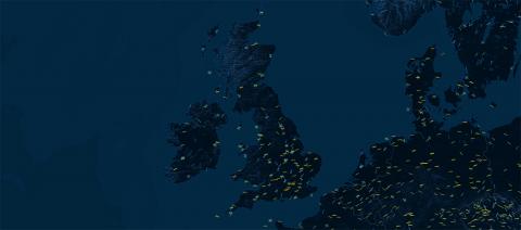
German data visualisation company Figures have created a data visualisation that illustrates the prevaling direction of the wind based on the direction of airport runways across the world.
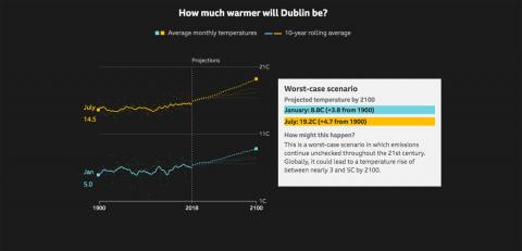
BBC News published an interesting interactive data visualisation showing the best case, medium-low, medium-high and worst case projected temperature increase scenarios for cities by 2100.
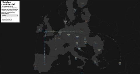
The Guardian published a very informative interactive visualisation on UK exports and imports to and from Europe, with the hope of preparing people for changes in their post no-deal Brexit shop. The site highlights some top level items but also allows you to select any category of good to see that import and export flow. Turns out the UK exports £27m worth of potatoes to Ireland.
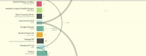
Information Is Beautiful released a fascinating data-visualisation comparing the size of different codebases, such as the 40,000 lines of code in the space shuttle vs the 40,000,000 lines of code in Windows XP! Check out the full list here.