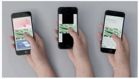
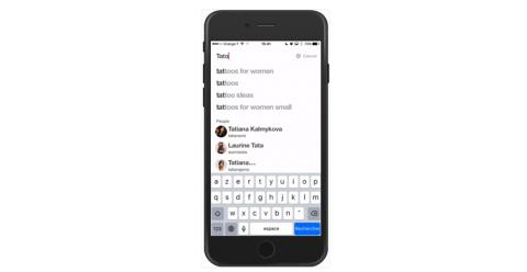
UX Movement have a handy post that describes bad practices on phone form fields, along with some recommendations on how to reach the holy grail of UX; don't make users think.
The Adobe MAX 2018 event demonstrated a plethora of AI enabled "multimedia" tools from Adobe this year. The innovations include the Moving Stills project which automatically generates an animated fly-through from a static image, ProjectKazoo which allows the user to hum a tune and generate sampled instrumental music from it and Fontphoria which automatically generates a custom font from one letter of a newly designed font. Check out these and the rest of the projects on the Adobe Blog.
The Behavioural Business Lab at RMIT University Melbourne Australia worked with RMIT lecturer and typographer Stephen Banham to create a new font called Sans Forgetica. The font is designed to invoke enough cognitive processing in the brain to prevent the scanning of the text and to prompt the brain to engage in deeper processing, thus enhancing memory retention. The aim of the font is to help students remember their study notes. Sans Forgetica is available as a free download and a Chrome extension.
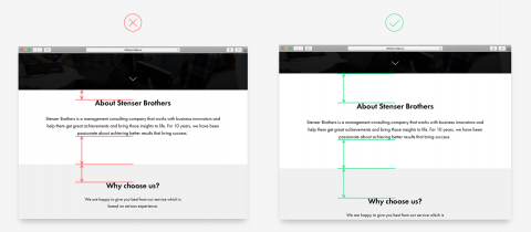
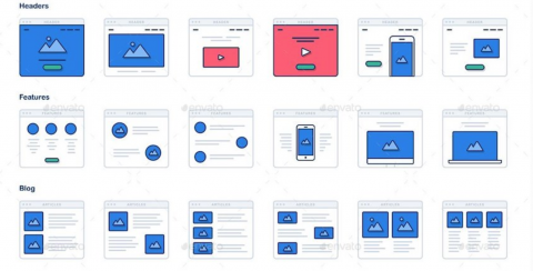
The Tilda Publishing Blog have a great post describing the most common webdesign mistakes made with layout, positioning, fonts and colours that are best avoided.
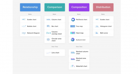
This is a very useful article by Taras Bakusevych on UXPlanet.org about the do's and dont's of dashboard layout and design. DAshboard type, graph purpose, layout flow and margins are just a few things that should be defined before design is addressed.
Susan Kare created the original Mac icons at Apple. This is a nice piece on Milanote about her work, including the origins of the Command key icon (⌘), which is used in Sweden to denote an interesting feature and is modelled on an aerial view of a castle with four turrets.