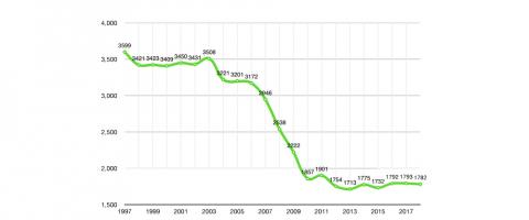
January 18th at Dublin Port Company marks the first workshop of the Uisce Salach project by Softday. The workshop will include a creative soundwalk participation and mapping as well as demonstrations of water sampling and sonification by Softday. You can contact [email protected] for details if you are interested in participating.
Jon Keegan has an interesting post on medium that analyses 122 hours of holiday radio from New York's WLTW 106.7 LiteFM. The data plots the most played Christmas song (Santa Claus is Coming to Town - all versions), most played specific version (Bing Cosby's White Christmas) and most played performers (Bublé) among other interested facts like plays per time of day and song versions by play count.
Data scientist Albert-Lázló Barabási analysed the sales patterns of 4,493 fiction and non-fiction books that made the New York Times bestseller list for hardcovers over thee last decade. The findings show the most popular categories of fiction and non-fiction books, that most book sell the most in their first week and that new-comers are best placed for success with book launches in February of March.
Another great visualisation from Information Is Beautiful. This can be considered "a living document" given the amount of flux in the Brexit position at the moment! :-p
Learning Dollars have put together a great list of 15 source code tools that can be used to help developers make sense of professional code bases, ranging from Chrome Developer Tools up to research projects to illustrate runtime events based on questions asked by the user.
The Information Is Beautiful Awards have released thie year's shortlists in categories such as Humanitarian, Breaking News, Leisure, Games & Sport and Visualization & Information Design, among others. Go inhale the data visualisation goodness on their site.
Australian software engineer Sarah Spencer hacked a 1980's knitting machine to create a massive equatorial star map, with the plan to exhibit it at the Electromagnetic Field Camp festival on Aug 31st, 2018. As a result, the star map is aligned with the night sky on the date of the festival!
I recently re-discovered The Pudding, a fantastic datavis site that uses visual essays to explain cultural ideas, such as the proliferations of repetitive pop lyrics and hip-hop vocabulary, a visual history of every Air Jordan and gender parity in the U.S. and U.K. governments.