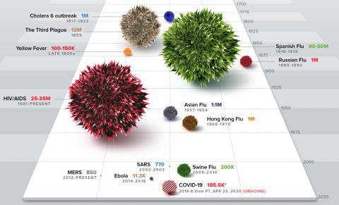
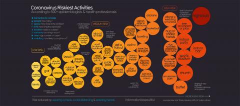
Data Vis

Trennd

Trennd collates the top google searches over time, to show you the popular topics as and when they blow up. You can search from 5 years to 3 months and you can see the monthly growth exponent and curve growth gradient.

Flight Carbon Calculator

The Guardian have released a flight carbon calculator, allowing you to select your starting and destination airports to see how much kilograms of CO2 emmissions are released per passenger on that return flight. it also shows you how many countries emit less CO2 per person per year compared to that flight. Aviation is responsible for 2% of global emissions and are set to at least double by 2050 :-(

Best Dogs

Check out the great and informative plot dataviz from Information Is Beautiful. The graphic shows the best breeds of dog and also differentiates between clever breeds and dumb breeds, like the poor Irish Wolfhound.

Despair

Dutch Data Visualisation specialist Sonja Kuijpers has published a powerful data visualisation which represents the number of people who died by suicide in the Netherlands in 2017.

Pages

Life Changing Smart Thinking Books

Subscribe to RSS - Data Vis