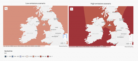
ESRI published a set of Climate Change Impact maps for Europe using their ARCGIS software. The maps show comparisons between low emmissions and high emmissions scenarios for sea levels, droughts, income for farmers, flooding and fires.
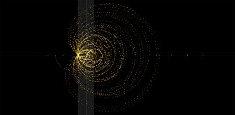
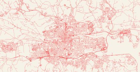
City Roads is a tool created by Andrei Kashcha that displays only the roads on a city map. The colours can be customised and the resulting image can be printed on a mug or exported.
Synesthesia is a rare sensory trait shared by about 4% of the population. Bernadette Sheridan has created an interactive tool to visualise the colours associated with the letters of a name as experienced by people with grapheme-color synesthesia.
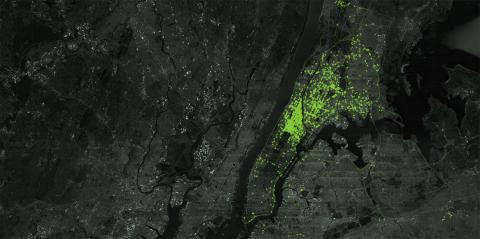
The New York Times published a fantastic exposé and data visualistion site about the scale of gathering and selling of location data. They obtained a file with 50 billion location pings of 12 million Americans and sifted through the data in horror. The data can be bought from data aggregation companies that offer data collected from apps on your smartphone, like news or coupons apps, not from telecom companies or the big tech companies.
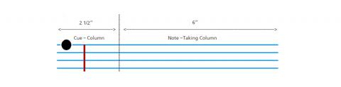
For those that prefer paper note taking, Cornell University has their own system of note taking, summarising and learning for the exam which seems quote efficient. However new research points to no major difference between paper and laptop note taking.
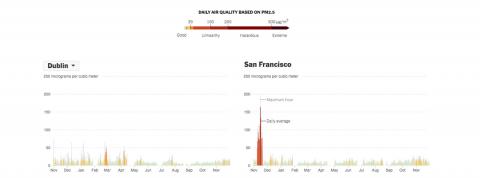
The New York Times released an interactive page showing the amount of air pollution in the world's major cities. The page also allows you to compare your city with some of the cities with the highest air pollution.