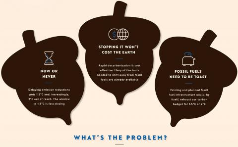
Sustainability of Food & Energy Production
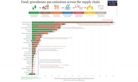
Hannah Richie wrote a great piece for Works In Progress on some natural assumptions and contradictions we have when thinking about the environmental sustainability of food and energy production. Did you know that the production of chocolate causes almost as much land use change as beef farming, or that energy production from coal causes 613 times as many deaths as nuclear power?