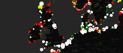
The Geodienst centre in the University of Groningen developed a real time map of the lighthouses around the world, including the cadence of the light beacon of each.
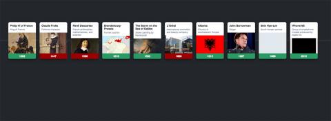
Test your history placement skills with the addictive game by Tom J Watson that asks you to consecutively place randomly selected events on an historic timeline.
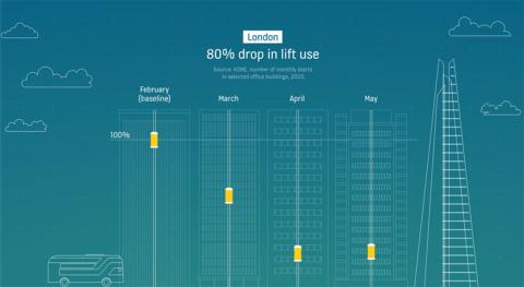
Kone, the lift (elevator) company published some nice datavis graphs showing a drop in lift use by 80% in the top 10 European cities during the initial pandemic period of February to April 2020. The graphs also show a 134%+ bounce-back for London in 2021, and 300%+ in Chicago.
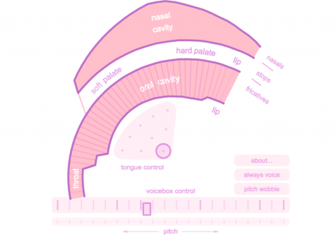
Pink Trombone is a fantastically fun simulation of speech being formed in your mouth. Use the controls to change the shape of the mouth to change the sound.