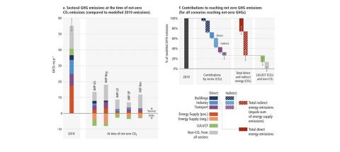
CNBC have curated the 9 most important graphs from the third IPCC report on the Climate Emergency. The report states that greenhouse gas emissions need to peak by 2025 if the world has a chance of limiting warming to 1.5 degrees.
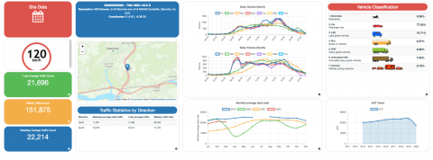
This week the Irish government launched the latest plans for the Cork to Limerick N/M20 road. The project website includes some nice summary statistics as well as access to a dashboard of live road sensors across Cork, Limerick & Tipperary.
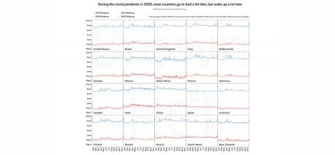
Jeff Huang and other researchers from Brown University published some interesting research on how sleep patterns across countries changed during the COVID-19 pandemic.
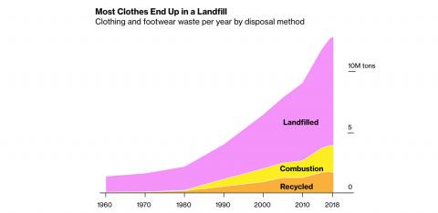
Bloomberg Green published a great page describing the massive detrimental impact that the fashion industry has on the environment. 11.3 million tonnes of clothes are thrown away in the U.S. each year, most of which contain polyester.
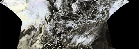
Open Weather is an artistic collaborative project that teaches people how to pick up the radio transmissions of the NOAA weather satellite and to submit your weather readings to contribute to the artistic and open archival project
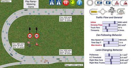
There are hours of fun to be had using this Traffic Simulator while you strive to achieve peak traffic flow efficiency across a number of different road layouts.